Loop brand
MY ROLES: Brand Strategy • Visual Branding • Conceptualization • Art Direction • Implementation
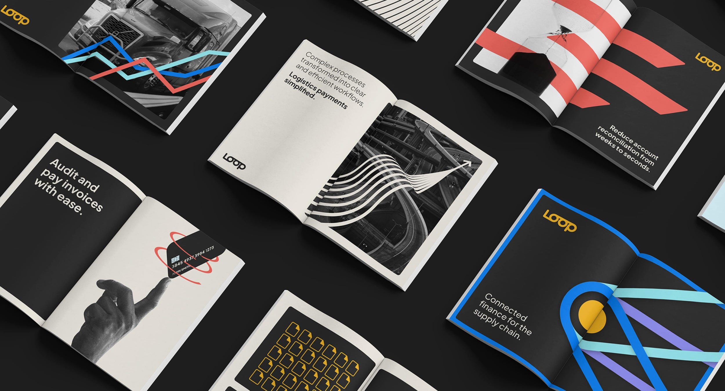
Working with a cross-functional team of stakeholders, I developed the brand expression for Loop, beginning with a workshop to determine the brand personality all the way through to building out brand guidelines and marketing assets. Loop is in the logistics industry, and their audience is more traditional and old school, but their AI-powered platform is revolutionizing logistics payments. The brand needed to both be able to speak to this audience and to appear modern and fresh, which provided a unique challenge.
The existing brand worked in some respects, but overall felt a bit too playful and unsophisticated. It also relied heavily on photography, which worked for some executions, but was not able to convey some more complex and abstract themes such as complexity to simplicity and connected finance. The existing logo was working well, but everything else needed an update.


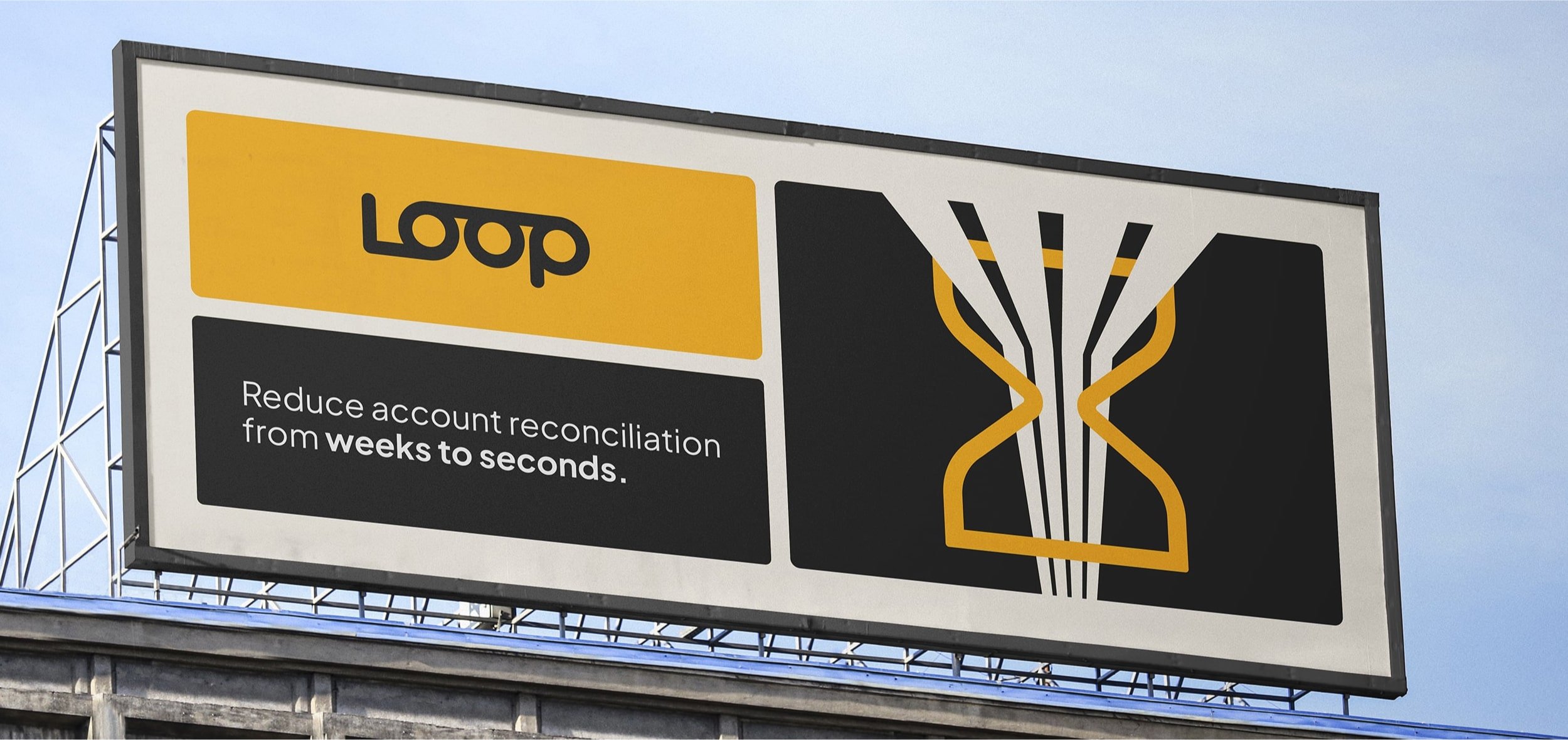
The palette has a simple, solid base with bright and energetic supporting hues. Together, the colors are striking, yet still feel grounded, communicating a modern and revolutionary company, but also one that is steady and reliable.


Taking inspiration from the logistics industry with its use of minimalist, clear symbols (think road signs or trucking logos), the brand expression uses graphic elements to convey a sense of power, purpose, and reliability. With uncluttered layouts that use modules to divide components, the viewer is protected from being overwhelmed by the strong visual elements. Overall the direction is bold, simple, and to the point, but with little twists that make it feel fresh and modern.

Bringing the brand to life in the Loop San Francisco office

Loop’s values are a huge part of the company culture, and so it was important to create graphics for each of them that both clearly represented each concept and were exciting for employees.


